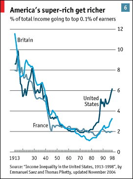
 I found this graph in an Economist survey about the US, see the graph in original context here. This graph certainly explains alot about the aristrocratization of American society.
P.S. The New York Times did a long series on Class in America.
I found this graph in an Economist survey about the US, see the graph in original context here. This graph certainly explains alot about the aristrocratization of American society.
No comments:
Post a Comment